
Food packaging design
What makes packaging feel expensive?
Restraint helps, but it is only part of the answer. Material, typography and the pace of information all shape perceived value.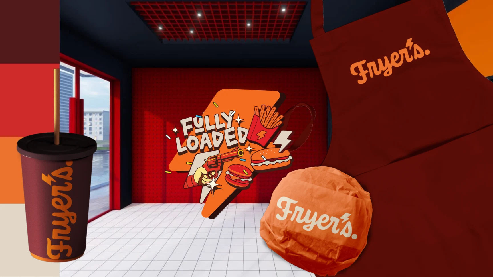
Premium is a system of signals.
A generous margin can feel composed or empty. A metallic finish can feel considered or loud. The difference is rarely one expensive production choice. It is the agreement between material, typography, colour, photography and the product itself.
When those signals point in the same direction, the pack feels assured. When they conflict, even a costly finish can feel decorative.
Give information a pace.
Premium packaging does not reveal everything at once. It gives the eye a first impression, a second detail and a final reward. That pace creates confidence because the pack appears to know what matters.
Make the product earn the treatment.
The strongest premium cue is credibility. The story, ingredients, format and price need to support the visual promise. Design can sharpen value, but it cannot replace the reason the product deserves attention.